Chromatic update: UI testing for React
Improving your workflow without adding more work
In September I announced Chromatic, a visual snapshot testing tool for React. It helps developers automatically test every UI component each commit to get notified of visual regressions.
I was floored by the response. UI bugs continue to plague thousands of React developers –often surfacing months after features ship. It was evident that I was not suffering regressions alone, and neither are you!
The team and I are steadily improving Chromatic’s ease-of-use, reliability, and speed behind the scenes. Our focus is improving your workflow without adding more work. Starting today, our progress will be published here.
Sign up below for free & unlimited Chromatic usage during the early access period!
Workflows that get out of your way
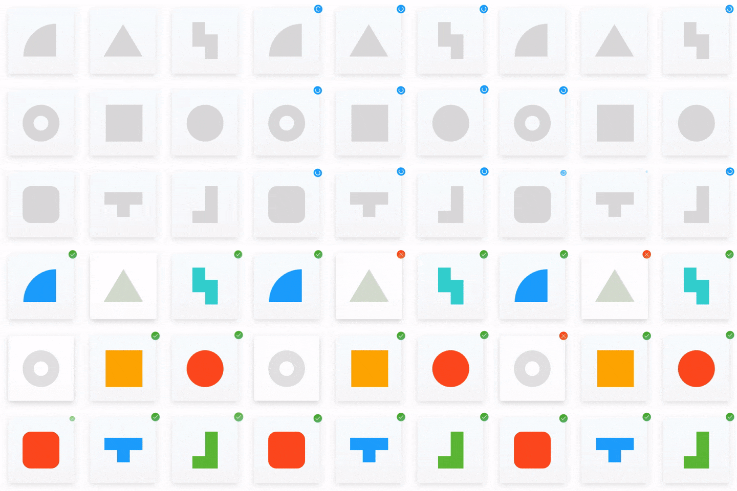
Chromatic takes image snapshots of all your components and compares them pixel-by-pixel to past versions so that you can catch UI bugs. It hooks into your CI service and runs every commit. The new features streamline this process.
Smart branching & merging
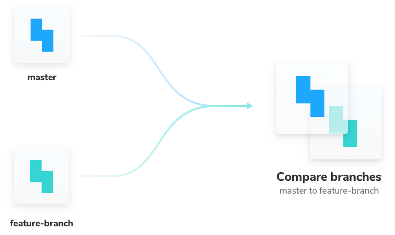
Our most-requested feature has landed! Chromatic now changes the baseline component snapshot that it uses for each build depending on your branch. When merging, snapshots from the new branch will be compared to the target branch automatically. This all happens behind the scenes and just works. Read more about it here.

Timely status notifications for pull requests
We shipped tagging GitHub pull requests from your Chromatic test builds. You’ll now get notified of the test build’s status in the review section of pull requests. This means you can check if there are changes to review without leaving GitHub. Read about it in the continuous integration docs.

Ignore dynamic elements
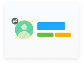
Sometimes certain parts of a component change every time it renders. For instance, an element displaying the current time or an animated gif. If that dynamism is intentional, you probably don’t want to re-approve it every test build.
Now you can ignore a specific DOM element in a component and Chromatic will disregard any visual changes inside it. Read more at our ignore regions docs.

Visual snapshot testing for Storybook
Thanks to insightful feedback from early access users, we’re shifting Chromatic’s focus to Storybook. As core maintainers and Storybook sponsors, it turns out this perfectly complements the work we’re already doing.
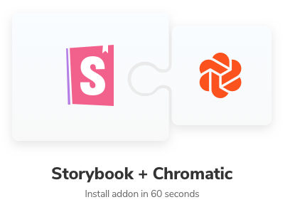
Storybook integration is now seamless. With the latest package (0.7.0), you can setup Chromatic as a Storybook addon in 60 seconds. Check out our getting started docs!

Setup Chromatic in less time than fixing one bug. Sign up for early access below!
🐇 Faster more convenient snapshot reviewing
Most apps have dozens of components with hundreds of UI states between them. When you release a complex feature a lot of states end up needing review. Developers spend a surprising amount of time QAing all these states.
Reviewing tests should be quick and painless. Chromatic now uses Apollo’s neat preloading feature to get a massive speed boost. In addition, the new batch reviewing buttons are a convenient way to confirm or deny changes in a snap.
📸 Adaptive snapshot sizing
Chromatic automatically sizes image snapshots to the exact dimensions of the component. This means that every component is easily recognizable when browsing your UI library.
We improved how we size snapshots of components that take up a full page by bumping up the default full page size to 1200x900. This means components like HeroImages, Headers, and ItemGrids, will be rendered at more realistic browser sizes.
Try Chromatic for Storybook
Chromatic is the visual snapshot testing tool for Storybook.